
Selecting Furniture: Proportion
Bunny Williams' apartment - full of pieces with good proportions.
Last month I wrote about the importance of scale when selecting furniture - the scale of a piece in relation to the room it is in and the scale of each piece in relation to the other pieces around it. If you want to create a room that is immediately pleasing to the eye, you also need to consider proportion when choosing furniture. Proportion refers to the relationship of one part of an object to its other parts.
Well-proportioned furniture isn't something that will jump out at you when you see a beautiful room - maybe not something you'd even think much about after taking it in for a while. Take the picture above, for example. Did you immediately think - wow, that looks great because all the furniture has good proportions? No, but if you study it, you'll see that they do. And when you have pieces that are really out of proportion, that can be jarring. You might not be able to put your finger on what exactly is wrong with them, but they draw negative attention. They prevent harmony in the room.
You might think any piece of furniture for sale in a store has good proportions because it's obviously been designed, constructed by a manufacturer, and chosen by a retailer. But unfortunately this isn't always the case. There are plenty of bad designs out there that make it to retail, especially when you're looking at low price-points. Because, let's face it, the lower the price point, the less time and/or care was invested in its design and construction.
And this doesn't just go for selecting furniture to buy from a retailer. DIY is huge today, which means many of us are choosing furniture from consignment stores, antique junkyards (yeah I'm thinking of you, mom!) - even what the neighbors might leave out for the garbage man! No shame in any of that, by the way. I've done it all. Of course we plan to clean it up, paint it, and put some cute knobs or fabric on it :) And then there are those talented enough to construct furniture themselves, even though they don't have any design training. So it's important today more than ever to judge a piece for good proportions before we buy, re-do or build it. Don't think that just because a design was really trendy for a time means it must have good proportions.
The good news is that judging good and bad proportions is pretty common sense. A delicate tabletop deserves slender legs. Chunky legs should be set with a heavy tabletop. A bulky desk or cabinet shouldn't have short little legs to stand on.
Below is an example of bad proportions, in my opinion. These skinny legs are way out of proportion with the bulky sewing cabinet they're holding up.
Below are examples of bad proportions straight from my NYIAD book. I didn't notice anything horribly wrong with Figure 18 on first glance. I did think Figure 19 looked strange, though. Do you see what's wrong?

The tabletop in Figure 18 actually belongs on the legs of Figure 19 and vice versa. The legs in Figure 18 are too delicate for that chunky top, and the ornate, bulky base of Figure 19 needs a heavier top. Here are the pieces with their appropriate tops and bases:

That looks much better, don't you think?
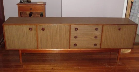
The sideboard style below was really popular in the '70s. But I don't think that means it has good proportions. This style is one of my pet peeves. The legs are way too skinny, and the fact that they are set in from the corners just makes it look worse, I think. The sides hang over the legs making the base look even more fragile in comparison to the top.
Okay, I'm sorry, but this DIY table below just looks dumb. Other than the fact that the top is an actual suitcase, the legs look too skinny with the thick suitcase top.

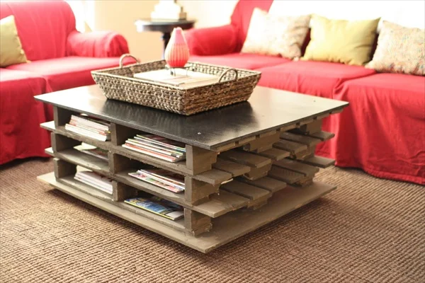
This coffee table isn't bad, but with so much going on in the base, plus the fact that the pallet shelves extend as far as the top does, I think it would be better if the top were thicker, wider, longer, or at least had some more interesting elements going on.
The principle of proportion also goes for pieces we combine to essentially form one object. For example, a lampshade + lamp is essentially one piece. The lampshade needs to be in proportion to the lamp!
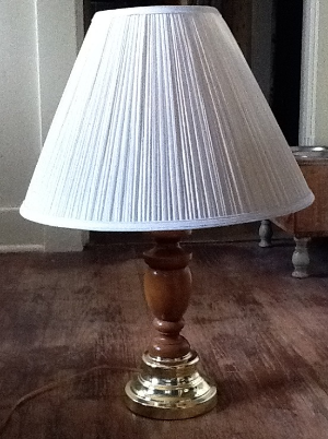
The shade below is way too big for this lamp - too long and too wide.
This shade is perfect for its base:
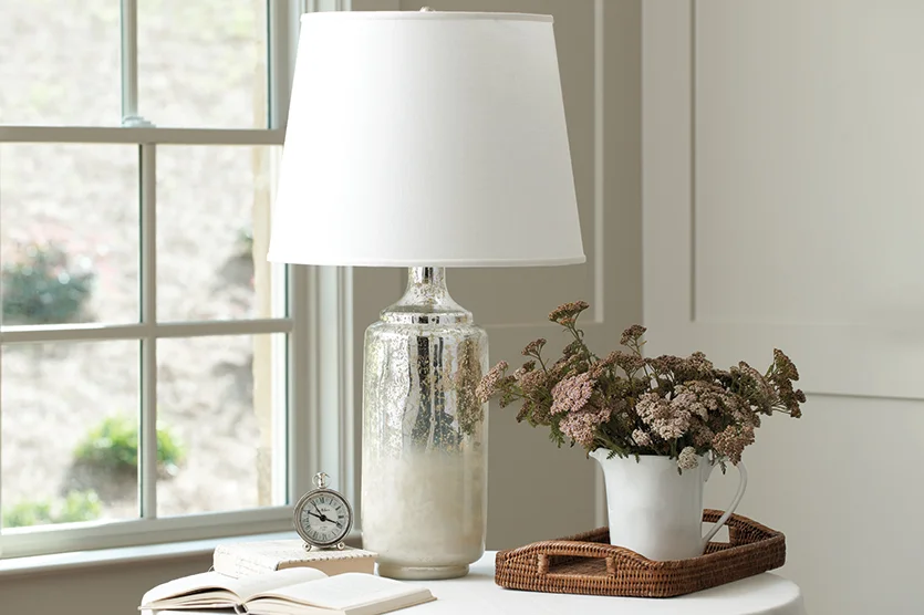
I found the picture above in this very informative post on how to pick the perfect lampshade - there are some great technical tips here!
Let's end with some rooms full of beautifully proportioned pieces. The first photo in this post, as well as the two below are the work of some female design greats of today - so of course the pieces are all in-scale and well-proportioned! See more of these photos here.

by Charlotte Moss

by Mariette Himes Gomez