Selecting Furniture: Think About Scale
It's about time for an interior design post! I need to start off by prefacing everything I post in regard to what I've gleaned from my interior design course with this - I know one of the biggest things proclaimed by designers today is "there are no rules in interior design!" I agree, to an extent, because it's art. You can justify any design as an artistic decision intended to make a statement or call attention to something. However...there are times when rules are more helpful to us in making decisions than the freedom to do anything we want. There are SO many options out there for every element of a room, from your wallpaper down to your lamp finial! Rules are really useful in keeping us from being paralyzed by indecision.
Your furniture is arguably the most significant element you'll decide on. It will take up the largest chunk of your budget if you're not doing renovations, so naturally you'll want to choose pieces you'll be happy with for a long time. Paint colors, accessories and even fabric is less expensive to change. And you don't just look at your furniture, so comfort and durability are huge considerations that you don't think about as much for other elements. Deciding on furniture can be overwhelming when you're faced with endless options, plus you know you're committing to your choices for many years. This is when you can be happy there are interior design rules to narrow down your options! (You can think of them as guidelines if the idea that someone can tell you there's a right and wrong for how you decorate your home makes you mad!)
SCALE
Following rules of scale is one way that will quickly eliminate lots of furniture options. In this context, "scale" refers to the size of a piece of furniture relative to the size of other furniture in the room or relative to the size of the room itself.
So if you're starting from scratch, search for your first piece of furniture with the size of your room in mind. A tiny bedroom can't handle a queen-sized bed. A big dining room shouldn't have a 36" round table with four chairs.
TIP: Start with the most important piece of furniture in a room. That's usually the biggest piece or what expresses the purpose of the room (bed in a bedroom, sofa in a living room, etc.).
It's really hard to find images online to illustrate examples of out-of-scale furniture! I can't for the life of me find an image online of a piece of furniture that's clearly out of proportion with the room size, but I'm sure you can imagine what that would look like.
So...once you have your first and most important piece selected, you can start looking for pieces you'll be placing in the same grouping that are in-scale with this first item. Now I can show you some bad examples...sorry in advance for the photos that are bad quality - I had to look in the most random places.
Look at the table below serving as a coffee table for this sofa and the two chairs on its left. The surface and the legs are both thin, which doesn't add any bulk to this table's small frame. This table is clearly too small and flimsy to pair with this dark brown, bulky sofa and club chairs.
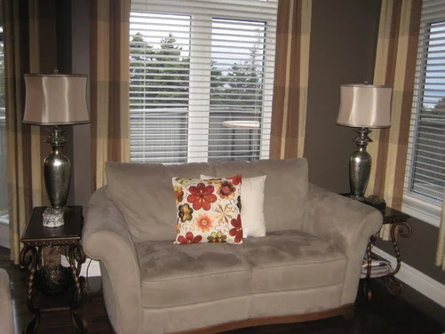
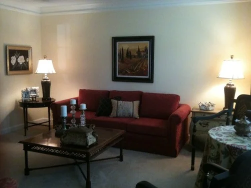
Below is an example of lamps that look out-of-scale with the loveseat.
The lamp shades seem to be towering over the sofa here, and I'm sure you would feel that way if you were sitting on it. Shorter lamps would work much better. Notice, though, that the end tables here are a good size for the loveseat - it's not huge, so the tables need to be fairly narrow, which they are.
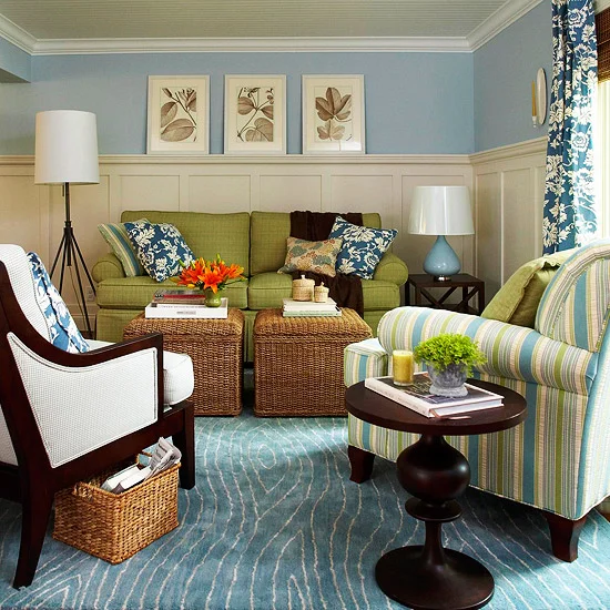
Here's an example of an in-scale arrangement. The two wicker ottomans/tables are the right size for the sofa, and the lamp on the side table is an appropriate height for the sofa.
VISUAL WEIGHT
In addition to size in terms of dimensions, visual weight affects scale. This has to do with how heavy one object appears relative to another, and nothing to do with its actual weight.
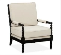
Look at the three chairs below. They're very similar in height, depth and width, but the leather chair looks much heavier than the other two. And the upholstered spindle chair on the right looks heavier than the chair in the center.
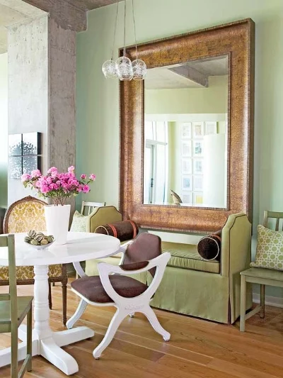
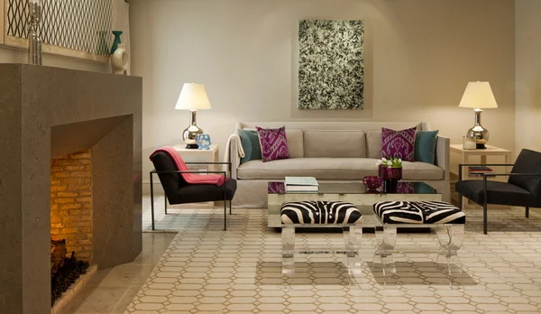
It would look unbalanced to position the chair in the center across from the leather chair. This doesn't mean you should buy furniture of all the same weight or scale for one room! You would end up with a totally heavy or totally light room, which would be visually unappealing and so boring! One of the hallmarks of good design is the ability to create interest in a room while still maintaining balance (see the first picture in this post). So if you wanted to use two of these chairs above in a room together, you would simply balance the lighter chair by adding an item to it. You could add a side table, or an ottoman, or both, or lots of other possibilities.
The chairs above have different visual weights mostly because of their different SHAPES. Visual weight is also affected by COLOR. A chair in a bright color has more visual weight than one in a muted color
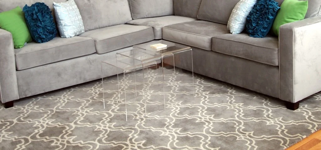
Below is an example of two pieces of furniture that are out scale with one another for all three reasons I've listed so far, IMHO. A set of acrylic nesting tables is paired with a very large sectional. First, a sectional simply needs a larger coffee table than this. Second, the shape of these tables makes them appear very light - they are thin all the way around with no base or structural detail. Third, they are clear! They are almost invisible, so even with this grey-colored sectional, which isn't a strong color, they appear too light.
Visual weight is affected by PATTERN, too. Just imagine a sofa covered in floral fabric versus a solid couch, and you know what I mean. A bold pattern adds visual weight, while a solid color or simple pattern reduces visual weight.
I'll end with some examples of in- and out-of-scale artwork. The piece of art over the sofa below is too small for it. There's too much empty space on both sides. You could make this picture work here by adding a couple smaller pictures or objects on either side of it.
I feel like this next arrangement has the same problem of too much empty space on both sides.
The gorgeous mirror below is an example of using just one in-scale object over a sofa.
P.S. looove this mirror and sofa!! So I'll end on that good note of a pretty picture.
Next time you're on the hunt for new furniture, keep these rules of scale in mind, and I promise you will immediately eliminate lots of potential options with confidence.

